
Getting Visual With It
Time to Get Vizzy With It!
Like Will says:
Gettin vizzy wit it Na na na na na na na nana Na na na na nana Gettin vizzy wit it…
Plot thickens
Time to turn on the lights and see what our data objects look like when we turn them
into visualized plots. Sure, we can use the print function to see the numbers within
our numpy objects. Better yet, let’s turn our objects into pretty graphical images. To do so, we turn to
the matplotlib library. An extensive library of plotting routines that easily allows us to render
image plots into many different formats (png, jpg, pdf, etc…) - both onto the screen for quick visual inspection, or written
to a file for general use.
Mandelbrot
To demonstrate the use of numpy and matplotlib let’s look at computing the complex numbers found in the Mandelbrot set. A quick review here of complex numbers and the Mandelbrot fractal generated by performing a calculation across a range of complex numbers.
A complex number is a number that can be expressed in the form $a + bi$, where $a$ and $b$ are real numbers, and $i$ is a solution of the equation $x^{2} = −1$.
The Mandelbrot set is the set of complex numbers, c for which the function $f_{c}(z)=z^{2}+c$ does not diverge when iterated from $z=0$.
Fortunatly, numpy can represent complex numbers just as easily as it represents integers or floats. We can create an array of complex numbers like:
a = np.array([[1+2j, 2+3j], [3+4j, 4+5j]])
>>> a
array([[ 1.+2.j,  2.+3.j],
       [ 3.+4.j,  4.+5.j]])
You may notice, we use $j$ and not $i$. Why you ask? Engineering convention uses $j$ whereas mathematicians use $i$. They both represent $\sqrt{-1}$.
Compute and Plot a classical Mandelbrot set
We’ll numpy and maplotlib to generate and plot the classical Mandelbrot.
Here is a basic gist of code that imports our libraries, defines a Mandelbrot function, and plots the calculated points.
import numpy as np
import matplotlib.pyplot as plt

def mandelbrot(h,w, maxIterations=25):
    y,x = np.ogrid[ -1.4:1.4:h*1j, -2:0.8:w*1j ]
    c = x+y*1j
    z = c
    divtime = maxIterations + np.zeros(z.shape, dtype=int)

    for i in range(maxIterations):
        z = z**2 + c
        diverge = z*np.conj(z) > 2**2
        div_now = diverge & (divtime==maxIterations)
        divtime[div_now] = i
        z[diverge] = 2

    return divtime

plt.figure(figsize=(10,10))
plt.imshow(mandelbrot(1024, 1024, 50))
plt.axis('off')
plt.show()
Let’s break down our code above into three sections:
- library imports
mandelbrot()function- plotting
The first section is straight-forward - but notice that we import the pyplot sublibrary and name is plt.
Next we define the mandelbrot function. The numpy functions that we need to understand here are ogrid, conj, and zeros.
Lastly, we take the return value from the mandelbrot function, our array of complex values representing divergence times, and pass this into the matplotlib pyplot.imshow() function. But before we do that, we want to set up our plot. We first use figure to establish the size of our plot. and we use axis to turn off the $x$, and $y$ axis which are on by default. Lastly, we call the show() function to render our plot onto the screen.

Pretty cool! and very straight-forwad. Let’s modify our function to pass the exponent of the function, $z=z^{exp}+c$ and modify our plotting to put multiple subplots into one plot. Rather than plot the classical function $z=z^{2}+c$, let’s examine what happens when we plot the following for exponents: $1.2, 1.4, 1.6$, and $1.8$.
Subplotting along
Instead of creating one plot of the classical Mandelbrot, let’s create one plot containing four subplots with the list of exponents above.
In order to create a subplot within our plot we need to specify a grid of rows and columns. We can then incrementally select each subplot, starting with the first row amd column, and proceeding left to right across the columns, and top to bottom across the rows, beginning with $1$ and ending with the $n^{th}$ row and $n^{th}$ column.
Modifying our code above, we can create a plot containing four subplots:
import numpy as np
import matplotlib.pyplot as plt

def mandelbrot( h,w, exp, maxIterations=20 ):
   y,x = np.ogrid[ -1.4:1.4:h*1j, -2:0.8:w*1j ]
   c = x+y*1j
   z = c
   divtime = maxit + np.zeros(z.shape, dtype=int)

   for i in range(maxIterations):
       z = z**exp + c
       diverge = z*np.conj(z) > 2**2
       div_now = diverge & (divtime==maxIterations)
       divtime[div_now] = i
       z[diverge] = 2

   return divtime

def makeplot(exps, h, w, iterations):

   plt.figure(figsize=(10,10))
   for e in range(len(exps)):
       plt.subplot(2,2,e+1)
       plt.imshow(mandelbrot(h,w,exps[e], iterations))
       plt.axis('off')
       plt.title('Fractal with exp = ' + str(exps[e]))
   plt.show()


exps = [1, 1.2, 1.5, 1.8]
makeplot(exps, 1024, 1024, 50)
Running our program would produce the plot below.
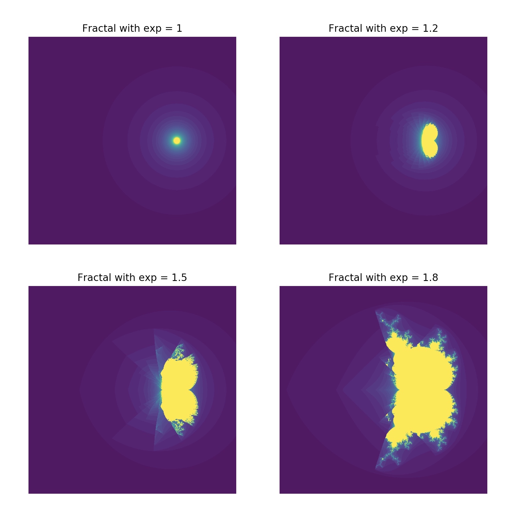
Disecting the code above, we see a few mods to the previous version that generated the classic Mandelbrot. We’ve added a function, makeplot() that we will call for each element in our array, exps, of exponents. Looking inside makeplot notice we first call plt.subplot(2,2,e+1). Here we are telling plot that we want a 2x2 grid of subplots, and we start with 1 (e+1 since e ranges from 0 to 4). Next we place the generated image into the plot with imshow. We turn off the axis, and lastly set a title. That’s it! There are many many more sophisticated things that you can do with matplotlib. As a noob, this just scratches the surface, but gives you a real-world feel of what can be accomplished. Look at the gallery of samples to see more elaborate examples.